In recent years we’ve seen a multitude of uniform designs in the major professional sports. But is that a good thing?
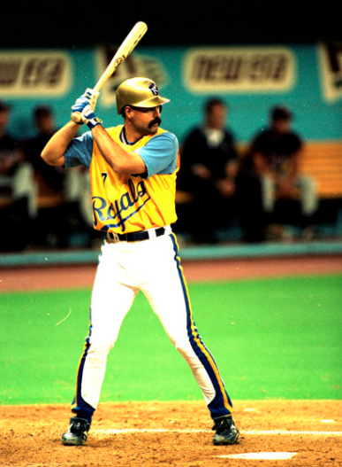
Since the 1980s, many sports have had “throwback” unis, and as far back as the 1960s we saw the arrival of “alternate” jerseys or mix-and-match options. The Kansas City Royals famously introduced multiple color options to go with their vest uniform, for example.
Of all the team sports, baseball has seen the most experimentation.
By the 1970s, most Major League Baseball teams had adopted polyester uniforms, and many had chosen to replace old-fashioned leather belts with multi-colored elastic waistbands. Who can forget Al Kaline getting into this late in his career?
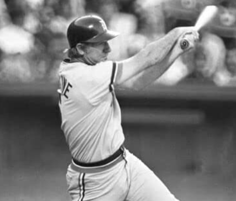
Detroit’s Al Kaline wears a polyester road uniform in 1973, with an elastic waistband.
That Detroit road uniform basically stayed in place for another 15 years after it was introduced in 1972. Luckily for Al, no matter he wore on the field, he was all class.
City Connect Uniforms
In the 1990s, some MLB teams experimented with a concept called “Turn Ahead The Clock,” where they outfitted their players in futuristic designs for a game or a series. Here are some examples:
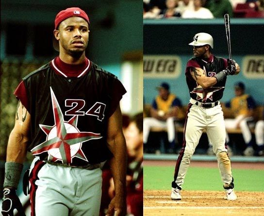
Ken Griffey Jr. in a Turn Ahead The Clock uniform in 1998.
An unidentified and rightfully embarrassed Kansas City player wearing a Turn Ahead The Clock uniform in 1998.
The Turn Ahead The Clock promotions were interesting, but didn’t really catch on.
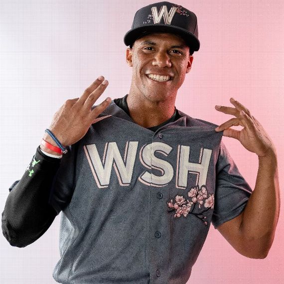
The City Connect Series from Nike seems to be more popular. It started in 2021 when MLB commissioned Nike to make uniforms for a select number of teams, to be worn during special series once that season. Each year, a few MLB teams will get a City Connect uniform.
In 2021, seven teams for City Connect uniform designs: the Arizona Diamondbacks, Boston Red Sox, Chicago Cubs, Chicago White Sox, Los Angeles Dodgers, Miami Marlins, and San Francisco Giants.
This year, seven more MLB teams: the Colorado Rockies, Houston Astros, Kansas City Royals, Los Angeles Angels, Milwaukee Brewers, San Diego Padres, and Washington Nationals, will get the treatment.
The Detroit Tigers are reportedly slated to get a City Connect uniform sometime in 2023.
What do you think of the City Connect uniforms? Are they ugly or art? Hate them or love them? Tell us in the comments section.
Mark Wilson
White unis for home, gray for the road. Why is this so hard today? If you want to sell these God awful jerseys on the team website, fine. But keep them off the field!
John David Danielewicz
GREED is a terrible thing and makes people do AWFUL things!!!!
PSB
Ghetto look. Not for baseball
John B
I guess I’m old school. I prefer the traditional unis. Those alternate uniforms should stay on the softball field. The current Tiger road jerseys are nice, but I like the block DETROIT jersey of the 60’s road unis. As for the home jerseys, PLEASE go back to the bold Olde English D of several years ago. Yes, I know the current one matches the cap, but it looks wimpy on the jersey. Hey, look at a photo of each one and I’ll bet you’ll agree.
Colt Rosensweig
Could not agree with you more!!
Colt Rosensweig
City Connect uniforms are, with a couple notable exceptions, unbelievably ugly. Or just boring. San Diego’s is probably the worst. Names in YELLOW on WHITE? That’s unreadable. (The rest of the color scheme also makes me want to stab my eyes out with a fork.) The Astros and White Sox turned out to get good ones. I honestly hope that they just forget the Tigers in this scheme. Or make the “City Connect” our correct home unis with the proper round-top D.
Don
The KC Royals player shown is Jeff King.
City Connect uniforms so far have been awful.
The Tigers need to go back to the real Old English D on the jersey. The road uniforms are fine. The 60s lettering was too boring and generic. Very plain. No style at all.
John Milner
I agree with many people on these comments about the English D change recently to match the cap. Just doesn’t look right. What really gets me is the fact that some places sell the throwback players uniforms but use the new English D on the chest. For example how could you have a Whitaker jersey with the new D. He never wore that. In fact never in tigers history till now have they wore that D on the chest. When that change happened I guess it was to match the cap. If that’s the case would have made more sense to change the cap. I wouldn’t have liked that either but at least you could make a case for it since the tigers did wear that D on their cap for many years in 1900s.
Also not a big fan of the alternate jerseys. All star game has lost some luster for me with the ASG caps and jerseys. Something about the colors of all the teams actual road and home unis in ASG was pleasing to watch.