Starting in 2018, the D on the caps and the D on the uniforms for the Detroit Tigers will match.
The iconic uniforms of the Detroit Tigers—one of the most popular and consistently unchanged in sports history—will be altered in 2018, the team announced late last year.
But fear not, Tiger fans, I bet most fans will not notice the alterations to the team duds even though it involves the classic Old English D.
The Old English D is one of the most recognizable logos in sports, so iconic that it’s transcended baseball and grown to become a symbol for a city. Yet, there’s been a little-known secret about the Old English D for years.
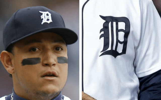
This photo of Miguel Cabrera clearly shows the D on the jersey and the D on the cap are not the same.
The Tigers’ Old English D has been a sham for years. The “D” on the caps and the “D” on the home uniforms have not matched for more than 50 years. Since 1961, the home uniforms have featured a rounded version of the “D” on the left breast while the caps have featured a “D” with sharper points and edges. The two logos have not technically matched each other all these years. Unless you were really looking closely, you may have never noticed the difference. But one person noticed.
[bctt tweet=”They call them “uniforms” for a reason. And starting in 2018, the Detroit Tigers, for the first time in more than five decades, will have uniforms that match.” username=”detroitathletic”]
Chris Ilitch, managing partner of the team after the death of his father Mike Ilitch in 2017, agreed to make the change, which had long been suggested by team officials and marketing experts. The official announcement was made this week during the annual Tiger Fest tour of Michigan. The team also announced that the cap logo will be larger on both the home and road versions starting in 2018, the first change to the home caps since before 1961.
This change makes sense. The logo, an official trademark of the brand and representative of the team, should be the same on the caps and uniforms. The team isn’t changing the “D”, they’re just making them, well “uniform” all over the board. According to the team, their research has shown that fans prefer the cap “D” over the more rounded uniform “D” that is disappearing. Had the decision gone the other way, and the caps were changed, fan response would have predictably been negative. The team chose wisely.
What of the decision to increase the size of the “D” on road and home caps? I like it. It’ll mean of course, that both the caps and jerseys are being altered for the 2018 season, which means if you’re a stickler who wants to wear the exact items the players wear, you’ll need to purchase both. But beyond that marketing benefit for the team and MLB, it’s also a tip of the cap to team history (sorry…).

The “D” on the cap worn by Charlie Gehringer in the 1930s was larger than the Old English D that was worn from 1968-2017.
The team has tinkered with the position and size of the Old English D on the cap many, many times. In my opinion the larger D has looked the best. According to the team (and to my eyes) the logo on the new caps is about 15-20% larger. It’s an obvious change, but not blatantly so. I for one, will have no problem purchasing a new cap with the new logo, especially the road version, which has always been a favorite of mine.
The Tigers have long been a conservative organization. Remember the time they closed sections of the center field bleachers at Tiger Stadium because fans were having too much fun? Or how the club refuses to retire a uniform number or erect a statue of a former player unless he’s been elected to the Hall of Fame? Or their slow adaptation to open market economics and free agency and acceptance of player agents. The Tigers for years have been like your stodgy old uncle who complains that “thinks aren’t like they used to be…grumble…grumble…” But in this case, the team is doing the right thing.
They call them “uniforms” for a reason. And starting in 2018, the Detroit Tigers, for the first time in more than five decades, will have uniforms that match. It won’t help them win games, but maybe they’ll look good while they struggle through a much ballyhooed rebuild.