The baseball cap has become a popular fashion item. It’s left the diamond behind and entered into everyday life. Once, only baseball players and little kids wore baseball caps. Now, the baseball cap is worn as a fashion statement.
Not all baseball caps are created equal, however. Some are U-G-L-Y ugly. Here are the 20 worst caps in baseball history.
#20. Boston Braves, 1914 Opening Day cap
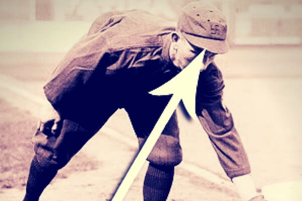
By 1914 the Braves had suffered though several losing seasons and were a second-fiddle to the Red Sox in Boston. The team was an embarrassment. As a way to turn their fortunes around, someone in the front office decided to put a good luck symbol on their caps at the start of the 1914 season. That’s why Rabbit Maranville is wearing a cap with a swastika on it in this photo. As baseball researcher Tom Shieber pointed out, long before the Nazis used it, the swastika was a good luck symbol that had been around for thousands of years. It might have had the intended consequences: the Braves went on a tear in the second half of the season and won the pennant. They proceeded to upset the heavily-favored Athletics in the World Series to win the championship. As a result they are known as the “Miracle Braves”.
#19. Toronto Blue Jays, 2000 alternate cap

There’s way too much going on here: the red bill and the huge block “T” with a bat-wielding Blue Jay tossing a baseball into the air. Also: explain to me how a bird gets a tattoo on his feathers?
#18. Chicago White Sox, 1987-90
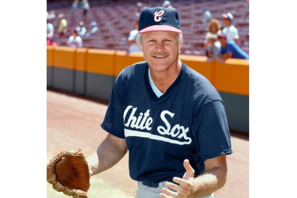
Few teams have changed their look as much as the White Sox, who once wore baggy pajama-style uniforms and shorts. Yes, really. In this instance, the White Sox introduced a curly cursive “C” to their caps in the late 1980s, or is it a curly cursive “E”, it’s hard to tell. Either way it looks amateurish and ugly.
#17. St. Louis Cardinals, 1976 road cap

The Cardinals have gotten most things right in their long history. They have one of the most iconic and attractive uniform logos in sports (the redbird on the bat), but they whiffed here. For the ’76 season they introduced the pillbox style caps for their road uniforms, with with white stripes on red. I get it — the idea was to honor ‘Merica on the bicentennial — but nope, not buying it.
#16. St. Louis Browns, 1940-45

The St. Louis Browns decided it was exciting to wear caps with a few vertical stripes on them. Sort of like the other Browns (Cleveland) wearing plain brown helmets. Yawn.
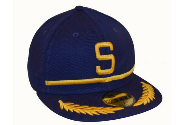
#15. Seattle Mariners, 1994 alternate cap

The Mariners have tried a lot of “S” logos on their caps over the years. I’ve never understood why they don’t stick with the trident, which was on their caps in their inaugural season. The colors here are really terrible.
#14. Houston Astros, 1995-99

Is this oversized monstrosity supposed to look like an “A” or a streaking comet or space capsule? Don’t know, don’t care. The Astros discarded it after a few years and reintroduced orange to their color scheme.
#13. Detroit Tigers, 1918-20

These are the only years when the Tigers didn’t wear the Old English D and it wasn’t a good idea. They looked like something a high school team would wear. When Ty Cobb took over as manager for the ’21 season, the Old English D was returned.
#12. Washington Senators, 1964-67

One year they made this even worse by making the cap all white.
#11. Cincinnati Reds, 2000-06 road cap

The Reds are one of the oldest (perhaps the oldest) professional baseball teams. They shouldn’t mess with their caps. Especially for these black and red mistakes.
#10. Los Angeles and California Angels, 1961-70

The halo on the top of the cap makes this team look more like a grade school play than a big league team. They didn’t play much like a big league team.
#9. Pittsburgh Pirates, 1940-41 road cap

Were they Pirates or bell hops?
The Pirates have not always worn black and gold, by the way. The franchise settled on that color scheme in 1948, and they’ve been with it ever since. But prior to the black and gold, the Pirates wore uniforms with various shades of blue and red, as well as royal and cream. Subsequently, and conveniently for their fans, all three Pittsburgh pro teams have adopted the black and gold.
#8. Chicago White Sox, 1982-86 home cap

All of this was terrible: the cap, the logo, the uniform. And we actually had to see all-time greats Carlton Fisk, Steve Carlton, and Tom Seaver wear these hideous duds.
#7. Arizona Diamondbacks, 1998-2000 home cap
![]()
Teal and purple are bad enough on their own, but putting them together is unforgivable. Those are fangs in the center of the “A” by the way. Ooohhh, scary.
#6. Milwaukee Brewers, 1994-96

Like the Mariners, the Brewers had a fantastic cap logo in their “ball and glove” M&B design. But by the 1990s someone in their merchandising department decided it was a good idea to change things up so they could sell more caps. This interlocking M&B is terrible. If you can find any baseball fan in the state of Wisconsin who proudly wears this cap, please let us know, because that would more rare than a Bigfoot sighting.
#5. Miami Marlins, 2012-present

Rule #1 of cap logo design is not to make the logo too big. The M and the “Marlin tail” jutting out from the left are threatening to swallow the cap. The M looks like a sun-drenched mountain top, which might make sense if they played near mountains. The logo is too flashy and loud, and too damn big.
#4. Tampa Bay Devil Rays, 1998-2000

Yes, that’s a “devil” manta ray floating across the cap, and yes that’s green, teal, yellow and purple mashed together in one logo. This was about the 15th uniform and cap change in Tampa Bay franchise history and they (thankfully) didn’t stick with it very long. It looks like a souvenir cap you’d get for $12 at a discount vendor stand outside the ballpark. Only the Minnesota Vikings and Los Angeles Lakers should be allowed to use purple in their logo.
#3. Cleveland Indians, Chief Wahoo (1986-present)

Let’s have a logo that shows a smiling caricature of a happy savage Indian warrior. That’s a good idea, right? Yikes, can we get rid of this racist logo now, please? (The Indians have announced that by 2020 they will cease using this logo.)
#2. Seattle Pilots, 1969
Thankfully this only lasted one season before the franchise moved to Milwaukee.
#1. Detroit Tigers, 1994-97 road cap

The Tiger is creeping from the center of a re-stylized D on this cap worn by the Tigers for four seasons in the 1990s. No one should ever mess with the Old English D. Not ever.
Which caps did you hate? Do you agree with any on my list? Tell me your opinion in the comments section below.